Case studies

Work

Brand identity and original sound, from one studio.

Crown Emcees — Family MattersFlagship

Music Production

Crown Emcees — Family Matters

Almost every beat on the album, built from scratch for these three voices. The process was collaborative rather than catalogue-based. I'd ask each brother whether he'd already written verses to something, or had a BPM or rhythm in mind. Often they'd bring a reference track they liked, and I'd build something in a similar tone and key that was completely its own — no sampling. Some songs I worked from the chord progression; others I'd find notes that matched the bassline or pads of the reference and breathe new life into them from there. The sound draws on the authentic West Coast '90s and funk already in my style, with drum rhythms rooted in boom bap to pull in the East Coast influence Spliff Chief brings — he's a profound lyricist with an unorthodox flow, heavily shaped by Wu-Tang. Every track but one is mine, and I mixed the beats across sixteen song projects. On the visual side: the crown drawing is theirs and predates me. They sent a photo of the original from back in the day and I rebuilt it as clean vector art in Illustrator. I also hand-drew a wordmark for the group name, photographed it, vectorised it and tightened both up. The wordmark is unofficial — offered to them to use if they want it.

View case study →
Wifey with a KnifeyFlagship

Brand Identity

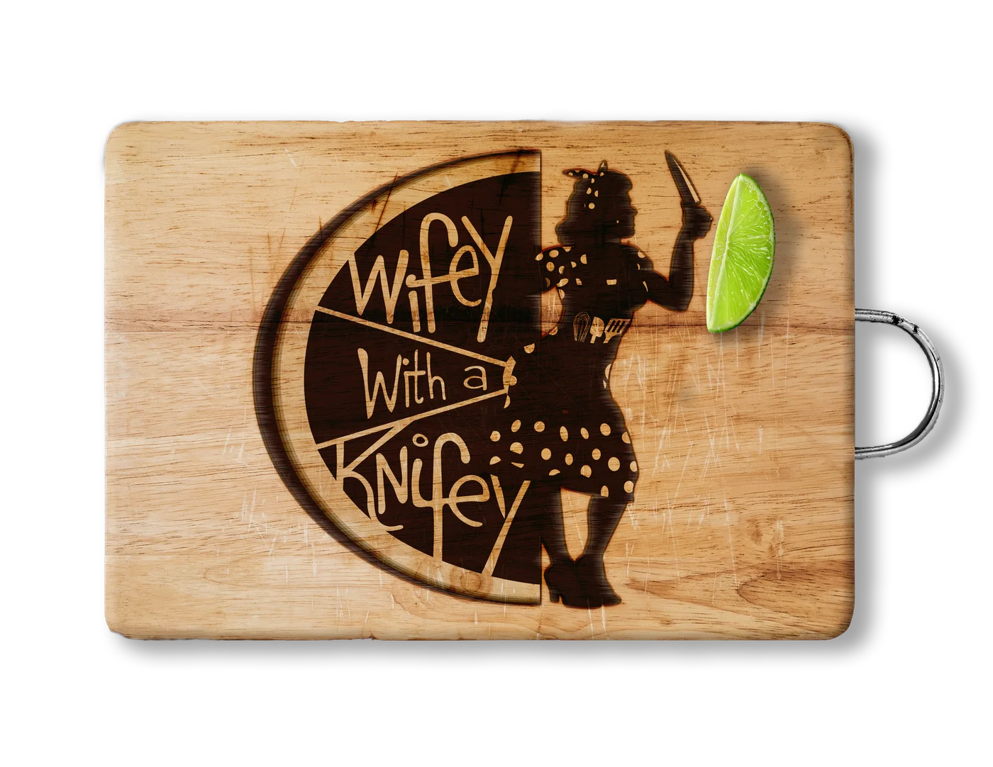
Wifey with a Knifey

The name first. 'Wifey with a Knifey' came out of a sign-off she used on notes she left her husband, and it was too good not to build a business on. The phrase borders on sinister just long enough to make you look twice before you land on what it actually means — which is exactly the kind of hook a food truck needs. From there, everything. Concept, wordmark, primary logo and variations, submarks and decals, colour palette, type system, character illustration, signage graphics, menus and table tents, merch, business cards, and a full brand style guide to hold it together. She was in the room for a lot of the brainstorming — this was built with her, not handed to her. The aesthetic leans on 1960s pin-up, mom's home cooking and Rosie the Riveter, aiming at summertime street food by the beach. The owner had the personality to be her own mascot, so that's what she became.

View case study →