Client
- Krypteia SOF
Sector
- Military Fitness Training
Year
- October 2021
Scope
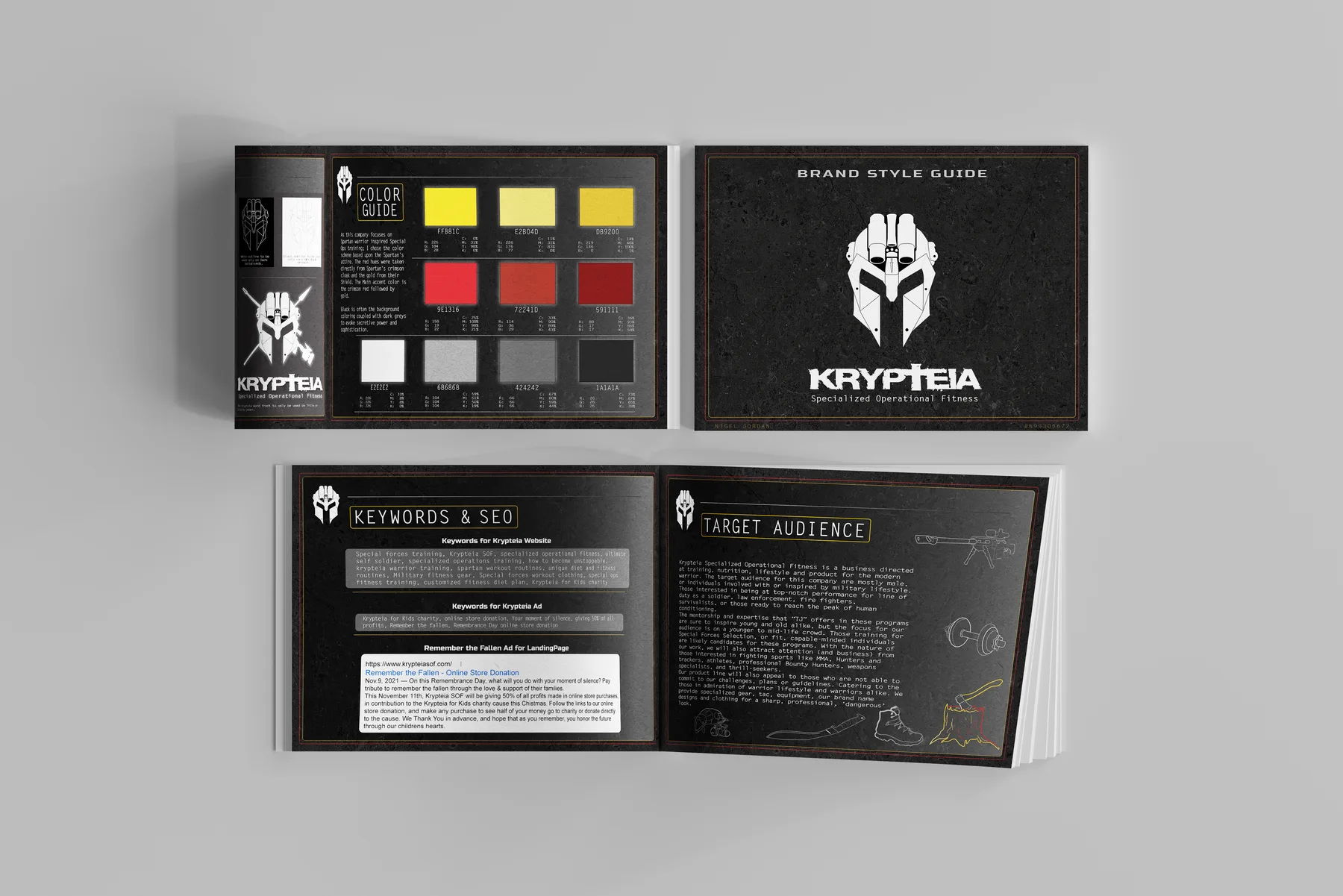
- Identity, apparel, campaign artwork, brand style guide
The problem
An online training company founded by Canadian military veterans. The audience is serving soldiers, law enforcement, firefighters and people training for Special Forces selection. They needed a brand with real weight behind it, not the usual fitness look.
The approach
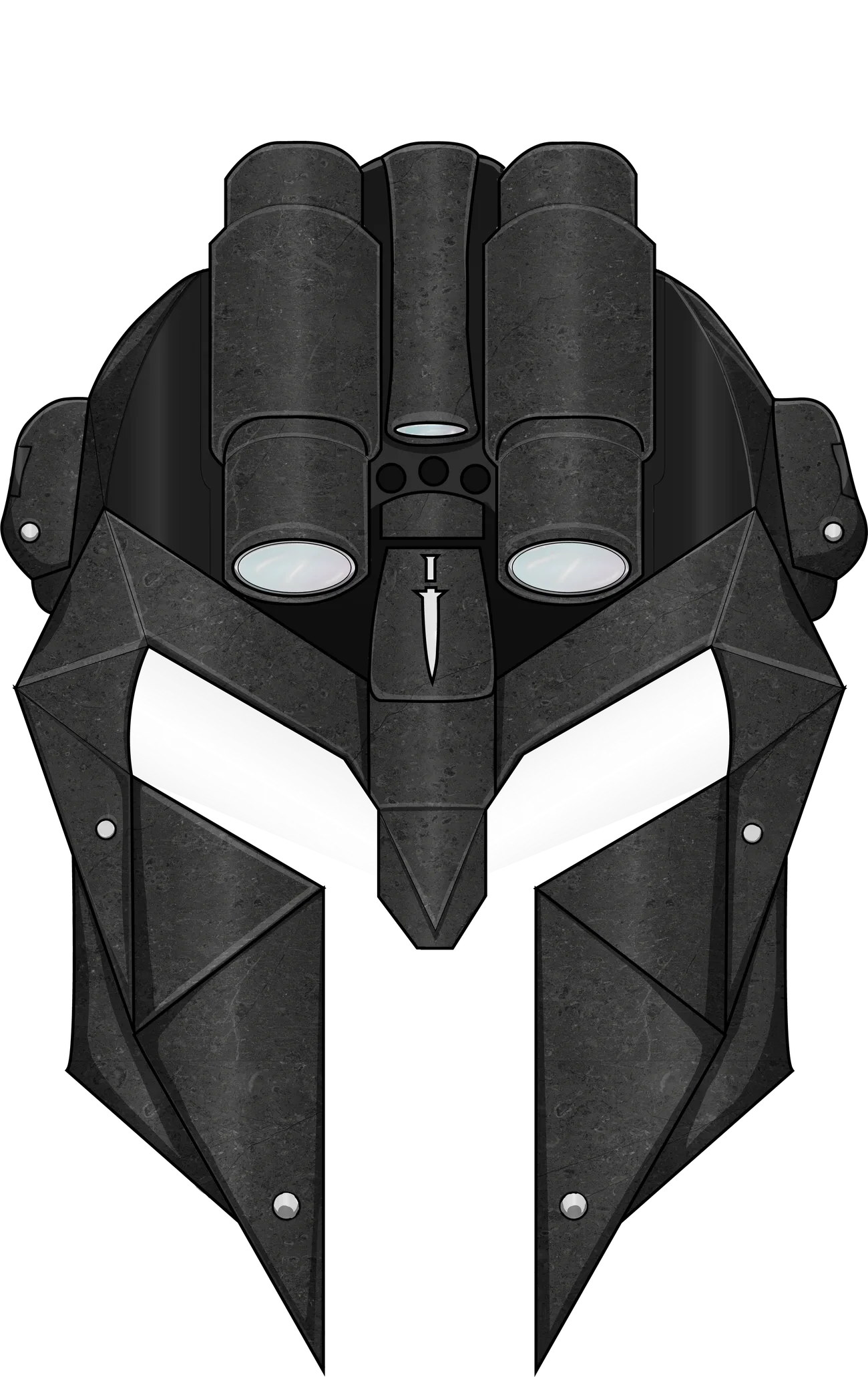
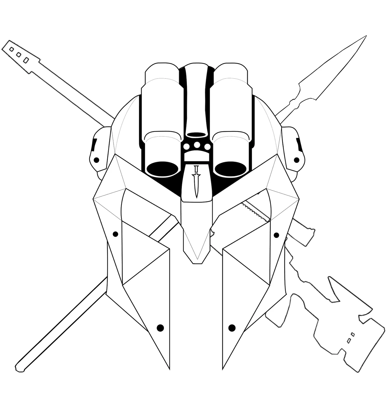
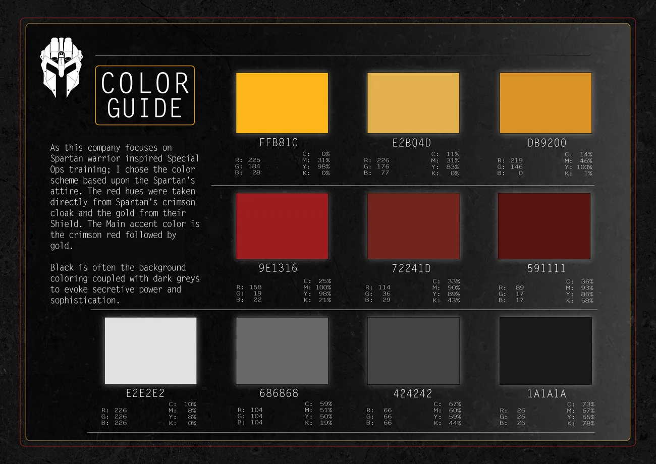
I built the mark by combining a Spartan helmet with Canadian forces insignia, and pulled the palette from Spartan colours. The reference had to read as earned rather than decorative, because their audience would notice immediately if it didn't.
The system
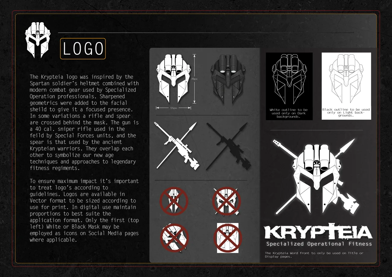
In application
Apparel
Apparel
Remembrance campaign newsletter
Campaign direction, including the Krypteia for Kids Christmas charity push
Product range
Scope
Eleven-month engagement building a full identity and apparel graphics system for a military-fitness brand. Delivered complete, style guide included.
Need a launch cut or a sound to go with it? That gets built here too. The sound