The brief
A literacy program running online sessions needed something that worked away from the screen. Not every household had a tablet, and the kids who needed the most practice were the ones least likely to get it between sessions. The ask was a printable workbook a parent could hand a six-year-old at the kitchen table with no setup and no instructions.
The guide
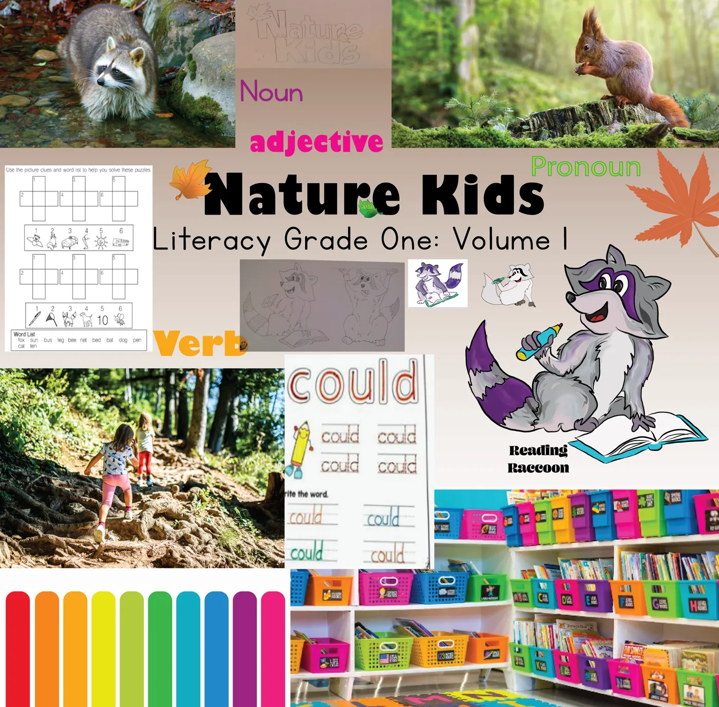
I built Reading Raccoon to carry the book. One character across every page, so a kid landing on page six already knows who is talking to them. The forest setting came from the same reasoning. Six-year-olds do better with a world they can re-enter than with a stack of unrelated worksheets.
What's in it
Seven pages covering parts of speech, syllable breaks, and upper and lower case. Each one built as a standalone exercise that still belongs to the same book.
Designing for the printer
This had to survive a home printer, which changed most of the decisions. No full-bleed colour fields eating through a cartridge. Every exercise legible if it came out greyscale. Type set large enough for a reader who is still tracking with a finger. Line weights heavy enough to hold up at draft quality on cheap paper.
Process
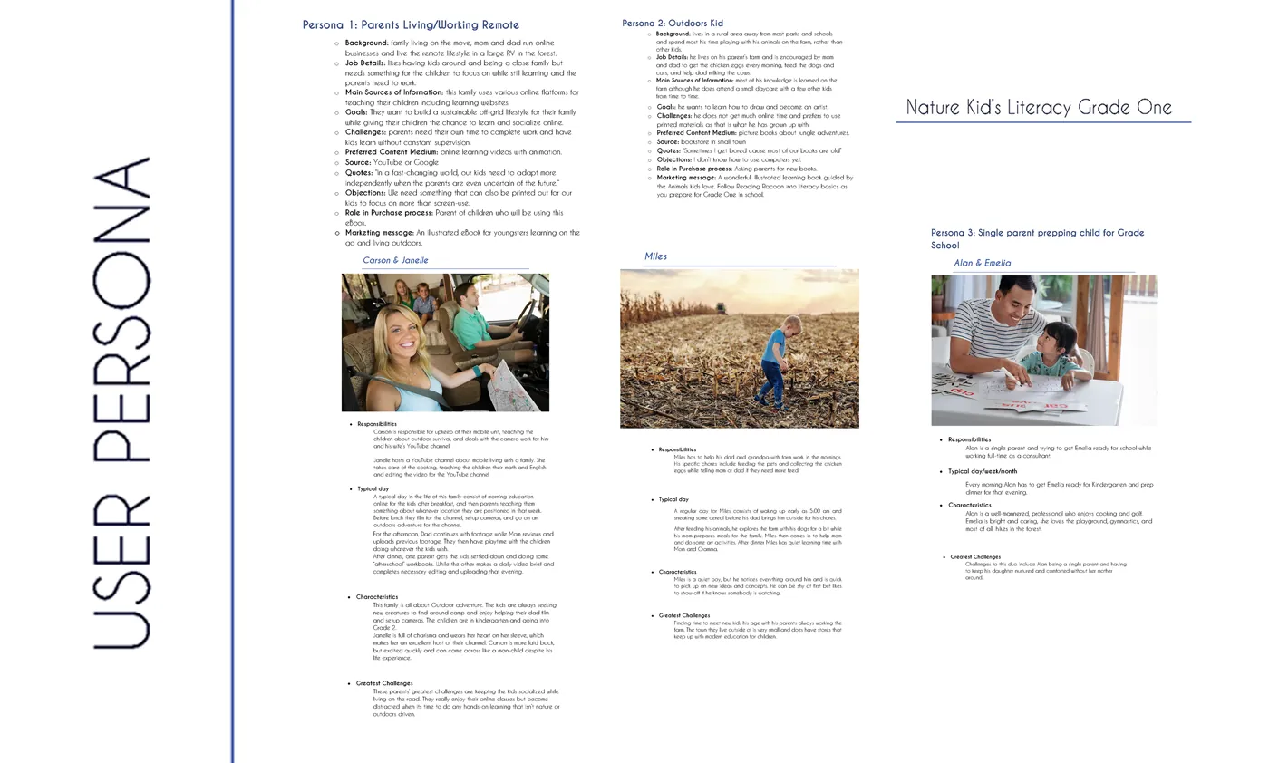
Research on Grade 1 literacy benchmarks came first, then a user persona for the parent doing the printing rather than the kid doing the reading, since the parent is the one who decides whether it gets used. Moodboard, then character, then pages. The written rationale is what kept the illustration decisions tied to the reading outcomes instead of drifting into decoration.