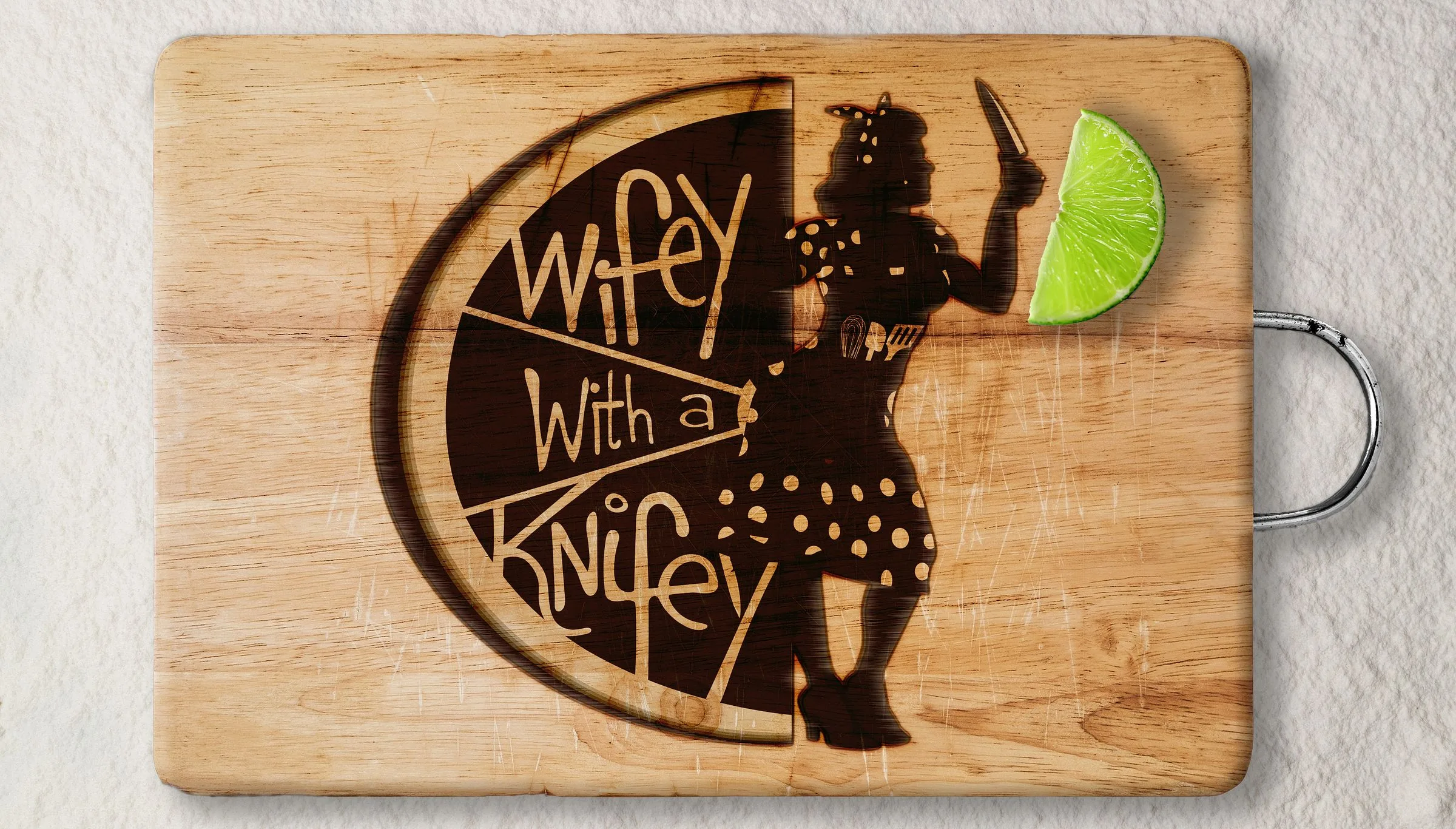
Client
- Wifey with a Knifey
Sector
- Mobile food service, BC interior
Year
- 2022
Scope
- Brand identity, illustration, style guide, signage, packaging, merchandise
The problem
A new mobile food business launching into a crowded market. Working markets, fairs and local stops across the Okanagan and Kootenays, where the truck has to be recognised from across a field. Food trucks compete on visibility before anyone tastes the food.
The approach
The owner had the personality to be her own mascot, so I made her one. The name came from how she signed off lunch notes to her husband. It borders on sinister, which makes people look twice and then work out what the knife is actually for.
The system



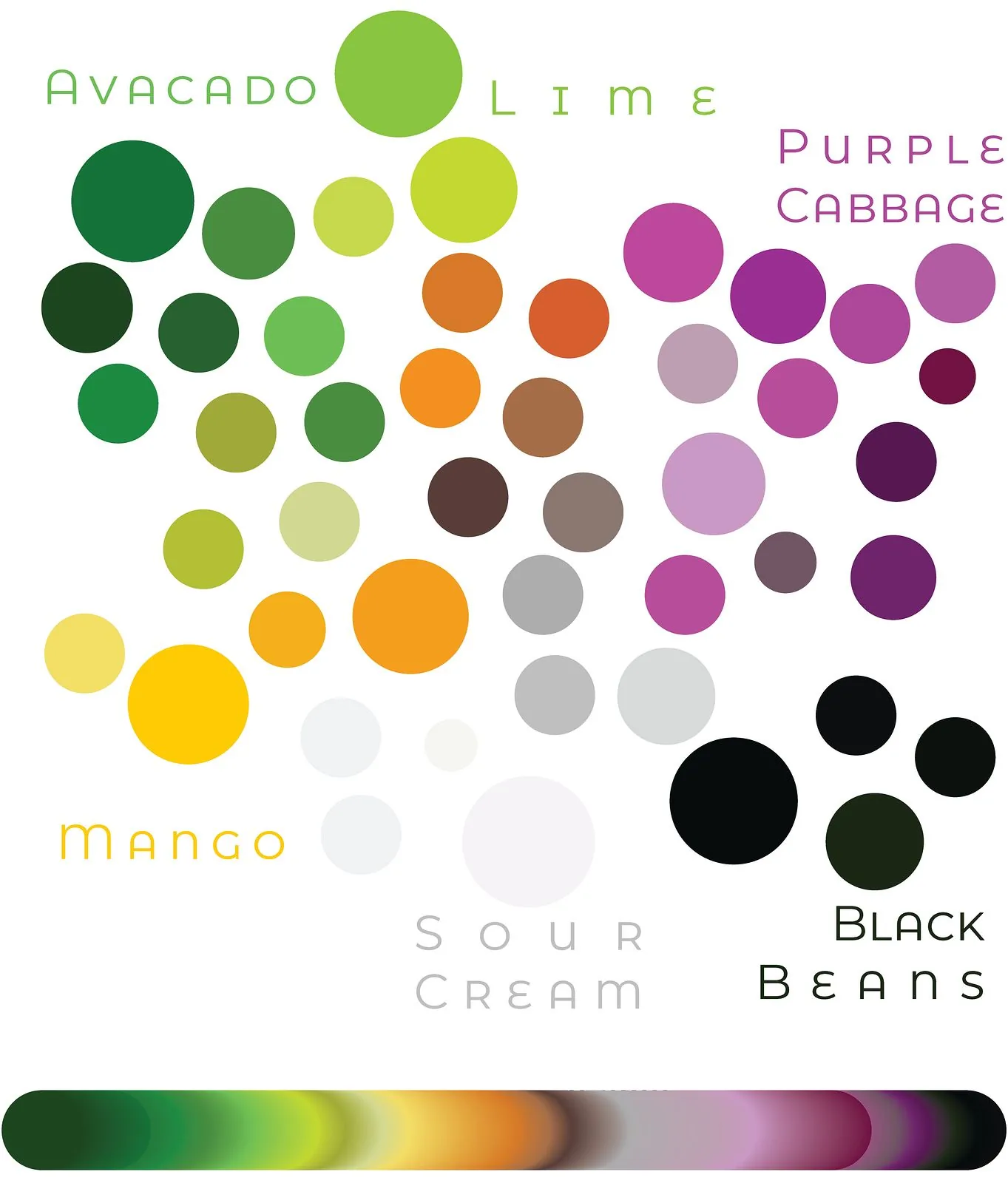


In application
Cart signage
Brand style guide. Opens to the whole book.
Table tents. Opens to the menu.
Service wear
Apparel
Winter apparel ad
Printed tees
Knitwear
Drinkware
Status
The full system was delivered before the truck existed, which was the point. The owner made the call to hold the brand until financing for the cart came through, so the identity, packaging and menu system were built to sit finished until that day arrives. Nothing gets rebuilt when it does. 24-page guide, 50+ iterations, delivered in under a month.
Need a launch cut or a sound to go with it? That gets built here too. The sound